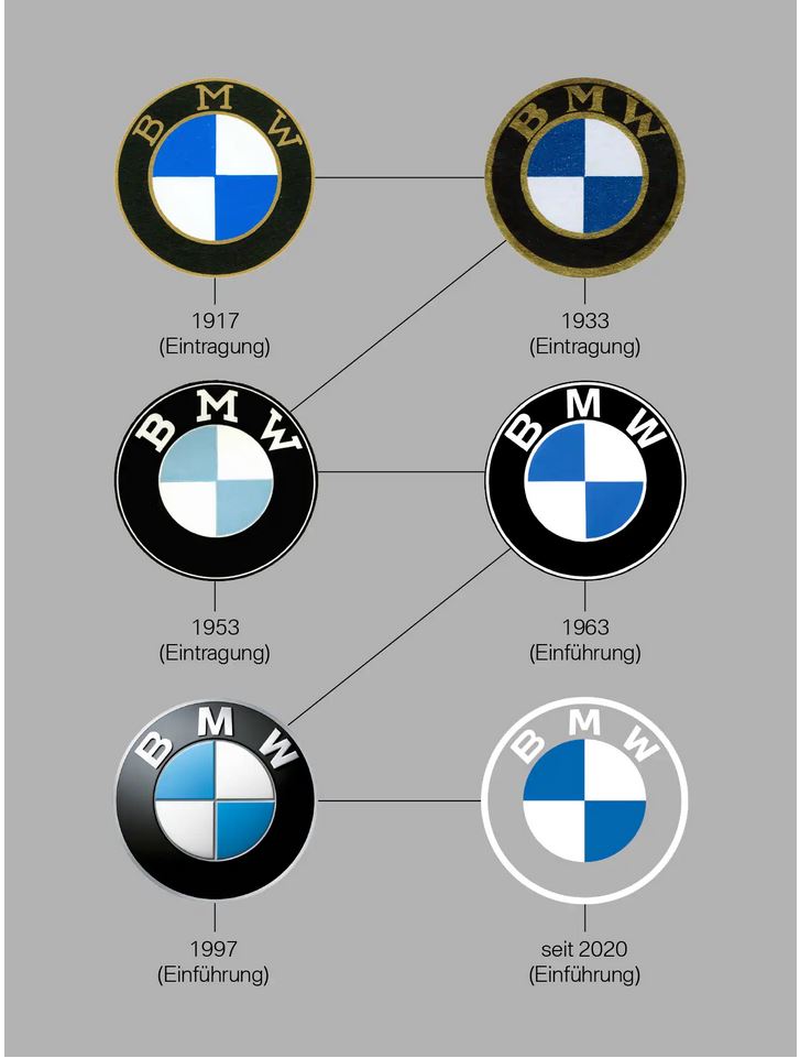
The company logo has become lighter and flatter to better match the trends of the digital and mobile age.

The BMW logo is not just famous, but famous and even legendary. Created over 100 years ago, it periodically underwent various changes, adjusting to new trends, but remaining the same recognizable. Now the updated logo and corporate identity of the company are focused on the generation of the digital age.
New BMW logo retained its usual shape, but at the same time became flatter. The middle still has the blue and white colors of the Bavarian flag (or a propeller against the sky - someone is used to counting here), but the outer ring has become white and flat. Minor changes have also been made to the font used for the "BMW" lettering. It would not be an exaggeration to say that this is the most noticeable change in the history of the emblem.

According to Jens Thiemer, Branding Officer, "The new logo and brand design symbolize the brand's importance and relevance to mobility and the joy of moving into the future."
It is believed that the new logo will invite customers to rediscover the brand with its history and products. By making visual changes and changing corporate style, the company wants to be perceived as more open and accessible. It also marks the start of BMW's electric era.
The company's sub-brands - BMW i and BMW M - are also getting their new logos, which have also become flatter, but remain well recognizable.
The new logo is not yet planned to be used on cars. It was created mainly for communication purposes (online and offline). However, it is likely that future models BMW electric vehicles will bear exactly the updated version of the emblem. But so far (as is often the case with abrupt changes), the new style has not delighted a wide audience and has been criticized rather harshly.


