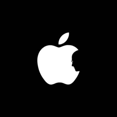
There are many companies in the world that are widely known not only to specialists, but also to ordinary users. But most of them do not have memorable logos. And very few have logos, the appearance of which is a whole legend.
Company `s logo Apple It is no coincidence that it is one of the most famous. There are many reasons for this - both the loud fame of the company and the recognition of the logo itself. There is such an old theory (although it does not stand up to serious criticism), according to which the logo should not only be memorable, but also such that any user can draw it on paper at any time. Car logos are great examples: Mercedes, Volkswagen, Opel... No less successful example and a bitten apple from Apple.
This logo is somewhat younger than the company itself. The fact is that at the beginning the creators wanted to beat the legend about the apple known to any schoolchild, which fell on Newton's head and allowed him to discover the law of universal gravitation. The idea as a whole is original, only the chosen logo was clearly cumbersome, not very memorable.
 |
| The first Apple logo. 1976 |
The logo in the form of a bitten apple was developed for the company by a representative of an advertising agency Regis McKenna (Regis McKenna Advertising Agency). According to the legend (namely, from this moment legends and conjectures begin), the art director of the agency, Rob Janoff, bought apples in the nearest supermarket and began to experiment, cutting them, arranging them in orderly rows and, in general, excelling in every way. But in the end, the development turned out to be very simple. Why is the apple bitten?
There are two main theories: the first is more plausible, it says that in this way the apple becomes more "real" and does not resemble any other fruit; the second is based on the similarity of English words "byte" ("byte") and bite ("bite"). There was also a case when a certain priest saw in the "bite" a clear allusion to the temptation of Adam and Eve. He did this, by the way, in a treatise in which he convincingly proved that Apple - from the Evil One.
They also say that Jobs, tired of waiting for a logo from Rob, watching his work, simply took a bite of one of the apples and said that if he doesn’t come up with anything in the near future, then let him take it as a basis. But this version can be questioned, since Rob himself never mentioned anything like that.

The first apple was rainbow. This was the reason for the emergence of another theory, according to which, in a bitten apple lies a deep meaning. Like, this is a direct allusion to the suicide of Alan Turing, a scientist who did so much for computer science and computer technology. He was gay and, as the story tells, committed suicide by eating a poisoned apple, unable to withstand the persecution of society. In many ways, it was thanks to Turing that they managed to quickly decipher the codes of the Enigma cipher machine, which was used by the Germans in World War II. However, after the end of the war, when Turing's sexual orientation became known, he was offered the choice of chemical castration or long-term imprisonment. He chose the first because he wanted to continue to fully engage in science. But the medical procedure performed on him affected his appearance. It was these changes that led to the suicide of the scientist. However, later Turing's mother believed that her son did not commit suicide, but poisoned himself by accident - in those days he experimented a lot with various poisons.
But the “homo-apple” theory does not stand up to criticism: the fact is that the rainbow became the official logo of sexual minorities a little later - for the first time gays officially used the rainbow in 1979, three years after the appearance of the “apple” logo. Most likely, the rainbow was taken (and Jobs insisted on using it, according to Rob's memoirs) as a symbol of tolerance and mutual understanding - this was precisely the meaning she wore from the very beginning. It was often used by hippies, to whom Jobs himself once belonged. It is also possible that this emphasized the fact that computers Apple able to work with color, which was a novelty in those years. Moreover, the theory seems much more plausible, according to which Apple in 1998 abandoned the iridescent color of an apple precisely because the rainbow began to be perceived as an invariable attribute of sexual minorities, which could lead to not the most pleasant comparisons for the company, which by that time actively formed a new image.

An interesting fact is that Jobs was discouraged from using the rainbow. Solely because the cost of printing documents (as well as floppy disk labels, user manuals, etc.) with so many colors in those years was too high. But such products looked much better than those of competitors with their monochrome printouts. From the very first days of its existence Apple attracted consumers with attention to detail.
But our story would be incomplete if we didn’t tell you that the designer Rob Yanov did not receive anything for his work, not even gratitude. Jobs managed to ingratiate himself with Regis McKenna so much that he helped the young company almost free of charge, providing the opportunity to use the services of his employees.


4 comments
I don't like apple.
It's not about love, it's about temptation
And you earn!)))
If you don't like it, don't write.
Some like apple, some like Android.
To each his own