In an effort to make its brand more youthful and dynamic, the South Korean manufacturer will add design ideas to the classic logo.
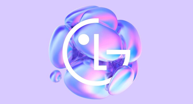
In total, it is planned to create seven new variants of the logo design. But so far only one has been presented, symbolizing, according to the company, people, youth, technology, peace and the future. It is stated that when developing this design, the designers were inspired by the images of blooming flowers and splashes from drops falling on the surface of the water.
Note that this is not about changing the logo itself, but about its design and design rethinking. He himself is well known LG symbol will remain unchanged, just “put” it on an unusual and attractive background, make it part of a complex composition with a predominance of purple hues.
The redesigned logo will be used across a wide range of media, online and offline. But first, it will be placed on the business cards of the company's employees. One side of the business card will feature employee details and contact information, while the other side will feature a new logo. At the same time, it is separately emphasized that these cards are planned to be made from environmentally friendly paper containing recycled cellulose.
It is expected that such changes will allow the company to make its brand more dynamic and youthful. According to LG representatives, the new design should appeal to representatives of the Millennial and Z generations.


