The Airbrb service, which helps in finding and renting housing, recently changed its logo, because the old one looked, well, quite frankly, nothing. However, the results of the innovation were quite unexpected.
 Old service logo
The new logo was designed by DesignStudio creative agency. Most likely, the designers just wanted to play with the capital letter "A". In addition, much attention was paid to the simplicity of the image, its memorability. It was especially emphasized that such a logo is easy to repeat even on misted glass.
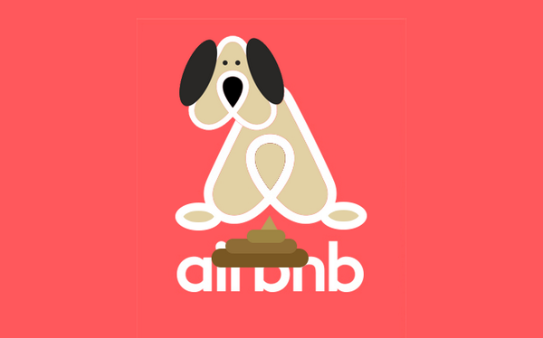
As a result, having presented a new logo, the representatives of the service offered the public to be creative, come up with new images and associations. And they were probably surprised when visitors saw the buttocks in the new logo, as well as male and female genitalia. There were other, less explicit ideas, but they also belong to the category of parodies.


However, is it really that bad? They will joke and calm down, but the Airbrb service received a portion of free advertising. Even if it's so unusual.


2 comments
Interesting blog, I enjoyed reading!
Thank you!