When it comes to logo design trends, you have to be very careful with your ratings.
After all, the use of certain approaches on several logos of famous brands does not mean the emergence of a trend. However, predictions and speculations from various designers and design companies can be found on the Web as to exactly which approaches will influence the design of logos in 2019.
This article is based on predictions from various design agencies. According to them, 2019 will not be the year of the emergence of any new trend, but the consolidation and rethinking of existing ones. At the same time, some designers believe that many of these trends are only temporary and we are gradually moving towards classic design values.
“Trends are short-term. It is extremely difficult to create something that will last for a long time and at the same time look appropriate in the medium or long term. Think of the identity of Coca-Cola, which transcends any trend compared to Pepsi, which is constantly changing, always striving to be trendy,” said Troy Wade, strategic head and co-founder of Brown&co.
Extreme minimalism
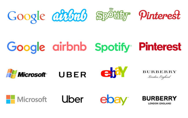
The trend towards extreme minimalism originated back in the 70s of the last century and has recently taken hold of digital design. Largely due to a number of practical benefits, such as reducing the loading time of the site and improving its reflection on the screens of mobile devices. Not surprisingly, the trend towards simplification eventually came to the world of logos, with the firm intention of staying in it for a long time.
As a result, brands, especially in the tech and fashion fields, are removing any extra elements in their logos, essentially focusing on fonts only. Moreover, in the vast majority preference is given to sans-serif fonts. Examples include the rebranding of American Express and Uber, where the focus was on extreme simplification.
gradients
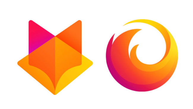
Over the past couple of years, gradients have become a real graphic trend. It is believed that Instagram, which updated its logo in 2016, became the founder of the fashion for using gradients in logos. In 2018, this trend has only intensified, and at the same time as the trend towards minimizing logos. Apparently, in 2019 there will be a lot of logos that are extremely simple and created using gradients.
Bright colours
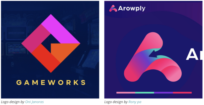
Bright colors are definitely one of the unchanging graphic design trends of the last few years. Nothing much will change in 2019. Bright colors can be easily adapted to different kinds of brands. In addition, bright colors can enhance the emotions that the logo conveys. Often combined with other trends, they will definitely become one of the logo design trends of 2019.
At the same time, choosing the right colors helps brands communicate more effectively with consumers. Instead of using random colors just to grab attention, in 2019 the meaning of logo color will be paramount. Designers will pay much more attention to the choice of color than has always been done.
"Metal" logos

The use of "metal" elements in logos is also far from a new idea. But in 2019, it will turn into a real trend. It can be expected that the use of this approach will become commonplace not only for jewelry brands, as it was before. The metal in the logo evokes in consumers associations with something upscale. In addition, the effect of shiny metal can highlight even a simple design.
Geometric logos

Geometry and logos are the perfect combination. And in 2019, the active use of geometric shapes in the creation of logos will continue. After all, logos should be symbolic, and each figure has a meaning. For example, a circle means eternity and fullness. The square conveys stability, etc. Geometric logos, whether they are flat, three-dimensional or containing perspective, are able to capture the essence of the brand and convey it in a very elegant and conceptual way.
Another advantage of a logo created using simple geometric shapes is its scalability. It doesn't matter if it is on a huge advertising poster or on a small business card, such a logo will not lose its shape and remain recognizable. Not surprisingly, many designers love this approach.
negative space

The idea of using negative space in logos has become a real trend. back in 2016 year and since then has not lost relevance. And no wonder, because this approach allows you to make logos more visually interesting, and also provides them with duality and additional depth. There is no doubt that negative space will be actively played up in 2019 logos. Moreover, we can assume that designers will begin to apply this approach even more actively.
Lots of small details
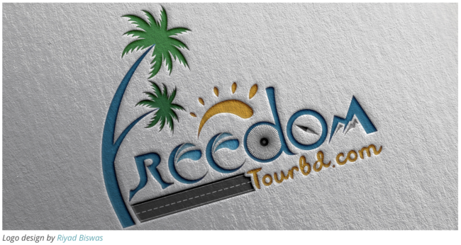
The trend is directly opposite to the desire for minimalism. While some brands are aiming to bring their logo almost to the point of primitivism, others in 2019 will strive for more detailed and thoughtful designs. Traditionally, the love for logos with lots of detail is inherent in companies involved in the production of alcoholic beverages and food products.
Creating such logos is a very complex process. After all, the end result should be not only beautiful, but also recognizable and well readable in small and large sizes. In addition, the designer needs to be able to “squeeze” all the wishes of the customer into the logo. But the result is worth it!
Overlapping elements
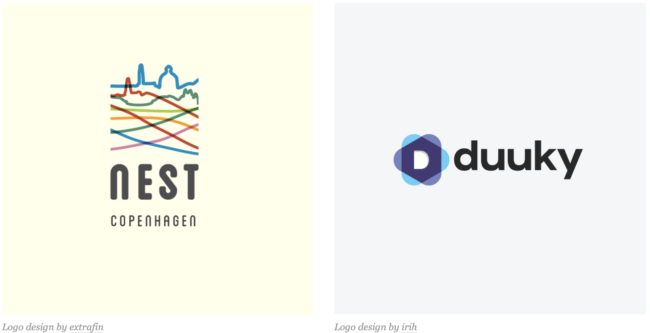
In 2019, we'll see more designers embrace the idea of overlapping elements. At the same time, this trend will be actively combined with others, whether it be bright colors, negative space, geometric shapes. Overlapping elements add duality to the logo and make it visually more dynamic. This approach opens up more creative possibilities for the designer.


