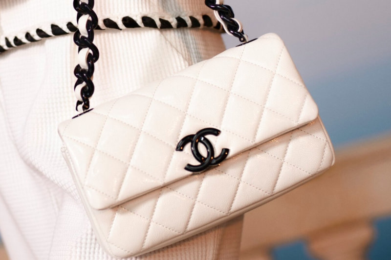
The court noted the similarity of the logos, but also emphasized that the differences are too significant for buyers to confuse them.
Chinese electronics manufacturer Huawei got into a litigation situation with a fashion brand Chanel because of the logo that the company chose to use in the European market. The new logo, which was applied for back in 2017, is a stylized letter "H" made up of two half-rings that look like chain links. For Huawei, a telecommunications technology company, the chain symbol is reminiscent of the people-to-people connections the company helps to make.
However, representatives of the fashion brand Chanel, the chosen logo seemed too similar to the famous mirror-image letters "C", referring to the name of the founder of the brand, Coco Chanel. As a result, the companies entered the process of litigation.

Back in 2019, the EU Intellectual Property Office rejected Chanel's objection, ruling that there was no significant resemblance between the logos. After that, the fashion brand appealed this decision to the General Court of the European Union. The trial ended on April 21st.
The Common Court of Justice in Luxembourg ruled that logos "have some similarities, but their visual differences are significant." In particular, it is emphasized that the Chanel symbol had more rounded curves and thicker lines than the Huawei logo. And the most significant difference is the vertical orientation of the Chinese manufacturer's logo, while the Chanel letters are located horizontally. Even with a distant resemblance, buyers will still not mix two images. Thus, Huawei has every right to use the selected logo for computer equipment in the European market.


